Definition:
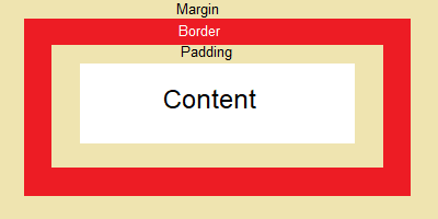
The CSS box – model is a container that is used to create a design and layout of an element. It contains several CSS properties including margin, border, padding, and the contents.
Syntax:
margin: 10px;
border: 2px dashed red;
padding: 5px;
See below an example of a CSS box – model of a single container.
Source Code:
<!DOCTYPE html>
<html>
<head>
<style>
.content{
margin: 30px;
border: 20px solid red;
padding: 20px;
background-color:pink;
width: 300px;
text-align:center;
}
</style>
</head>
<body>
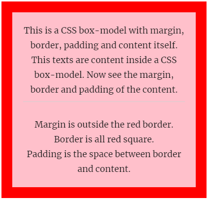
<div class="content"> This is a CSS box-model with margin, border, padding and content itself. This texts are content inside a CSS box-model. Now see the margin, border and padding of the content.<br/><hr/>
Margin is outside the red border. <br/>
Border is all red square.<br/>
Padding is the space between border and content.
</div>
</body>
</html>
Output:
CSS Box Shadow
Definition:
You can create your container with box shadows in any direction you like. You can use the box-shadow property to apply shadow in a box.
See an example with the source code of using box-shadow.
Source Code:
<!DOCTYPE html>
<html>
<head>
<style>
.content{
margin: 30px;
border: 20px solid red;
box-shadow: 15px 15px;
padding: 20px;
background-color:pink;
width: 300px;
text-align:center;
}
</style>
</head>
<body>
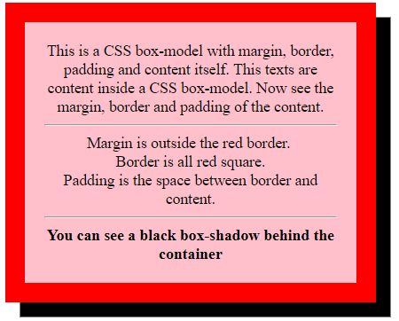
<div class="content"> This is a CSS box-model with margin, border, padding and content itself. This texts are content inside a CSS box-model. Now see the margin, border and padding of the content.<br/><hr/>
Margin is outside the red border. <br/>
Border is all red square.<br/>
Padding is the space between border and content.<br/>
<hr/>
<strong>You can see a black box-shadow behind the container</strong>
</div>
</body>
</html>
Output:
Box-shadow with color
You can give different shadow colors in your box or container.
Syntax:
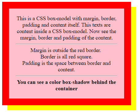
box-shadow: 15px 15px yellow;Replace the above code with this code and see the output. I have shown the output below and also the source code for your reference.
Source Code:
<!DOCTYPE html>
<html>
<head>
<style>

.content{
  margin: 30px;
  border: 20px solid red;
  box-shadow: 15px 15px yellow;
  padding: 20px;
  background-color:pink;
  width: 300px;
  text-align:center;
}
</style>
</head>

<body>
<div class="content"> This is a CSS box-model with margin, border, padding and content itself. This texts are content inside a CSS box-model. Now see the margin, border and padding of the content.<br/><hr/>
Margin is outside the red border. <br/>
Border is all red square.<br/>
Padding is the space between border and content.<br/>
<hr/>
<strong>You can see a color box-shadow behind the container</strong>
</div>

</body>
</html>
Output: