Definition:
CSS linear gradients can be generated by at least two different colors and transitions can flow from left to right, top to bottom, or vice versa. You can use the background-image transition according to your element’s background needs.
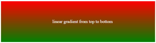
The linear gradients that create the background image from top to bottom is a default linear gradient.
Syntax:
background-image:linear-gradient(direction, color1, color2, ...);Linear Gradients (Top to Bottom):
This is a default linear gradient. It starts the red to green color transition from the top and ends at the bottom.
<!DOCTYPE html>
<html>
<head>
<style>
.linear{
  height: 150px;
  background-image: linear-gradient(red, green);
  text-align: center;
  line-height: 150px;
  color: white;
}
</style>
</head>
<body>
<div class="linear">linear gradient from top to bottom
</div>

</body>
</html>
Output:
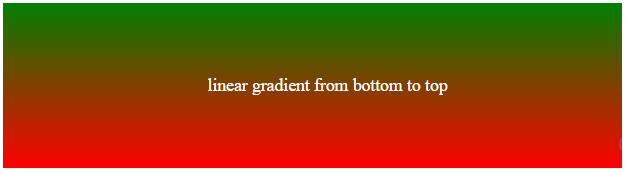
Linear Gradients (Bottom to Top):
The red to green color transition starts from the bottom and ends at the top.
<!DOCTYPE html>
<html>
<head>
<style>
.linear{
  height: 150px;
  background-image: linear-gradient(to top, red, green);
  text-align: center;
  line-height: 150px;
  color: white;
}
</style>
</head>
<body>
<div class="linear">linear gradient from bottom to top
</div>

</body>
</html>
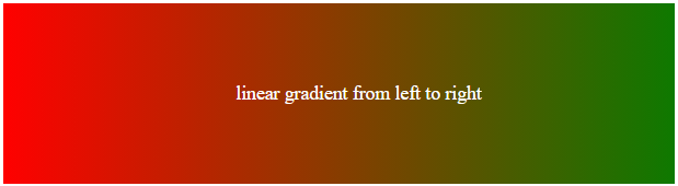
Linear Gradients (left to right):
The red to green color transition starts from left to right.
<!DOCTYPE html>
<html>
<head>
<style>
.linear{
  height: 150px;
  background-image: linear-gradient(to right, red, green);
  text-align: center;
  line-height: 150px;
  color: white;
}
</style>
</head>
<body>
<div class="linear">linear gradient from left to right
</div>

</body>
</html>
Output:
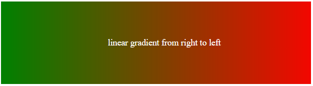
Linear Gradient (Right to Left):
The red to green color transition starts from right to left.
<!DOCTYPE html>
<html>
<head>
<style>
.linear{
  height: 150px;
  background-image: linear-gradient(to left, red, green);
  text-align: center;
  line-height: 150px;
  color: white;
}
</style>
</head>
<body>
<div class="linear">linear gradient from right to left
</div>

</body>
</html>
Output:
Linear Gradient (Diagonal):
Linear Gradient can be generated by defining both horizontal and vertical starting positions. You can go any direction you like from top left to bottom right, top right to bottom left, bottom left to top right, and bottom right to top left.
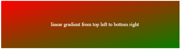
Linear Gradient(Top Left to Bottom Right):
The red to green color transition starts from the top left corner to the bottom right corner. See the below source code with output.
Syntax:
background-image: linear-gradient(to bottom right, red, green);Source Code:
<!DOCTYPE html>
<html>
<head>
<style>
.linear{
  height: 150px;
  background-image: linear-gradient(to bottom right, red, green);
  text-align: center;
  line-height: 150px;
  color: white;
}
</style>
</head>
<body>
<div class="linear">linear gradient from top left to bottom right
</div>

</body>
</html>
Output:
Linear Gradient(Top Right to Bottom Left):
The red to green color transition starts from the top right corner to the bottom left corner.
Syntax:
background-image: linear-gradient(to bottom left, red, green);Source Code:
<!DOCTYPE html>
<html>
<head>
<style>
.linear{
  height: 150px;
  background-image: linear-gradient(to bottom left, red, green);
  text-align: center;
  line-height: 150px;
  color: white;
}
</style>
</head>
<body>
<div class="linear">linear gradient from top right to bottom left
</div>

</body>
</html>
Output:

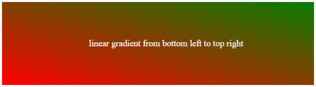
Linear Gradient (Bottom Left to Top Right):
The red to green color transition starts from the bottom left corner to the top right corner.
Syntax:
background-image: linear-gradient(to top right, red, green);Source Code:
<!DOCTYPE html>
<html>
<head>
<style>
.linear{
  height: 150px;
  background-image: linear-gradient(to top right, red, green);
  text-align: center;
  line-height: 150px;
  color: white;
}
</style>
</head>
<body>
<div class="linear">linear gradient from bottom left to top right
</div>

</body>
</html>
Output:
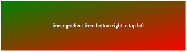
Linear Gradient (Bottom Right to Top Left)
The color transition starts from the bottom right to the top left corner.
Syntax:
background-image: linear-gradient(to top left, red, green);Source Code:
<!DOCTYPE html>
<html>
<head>
<style>
.linear{
  height: 150px;
  background-image: linear-gradient(to top left, red, green);
  text-align: center;
  line-height: 150px;
  color: white;
}
</style>
</head>
<body>
<div class="linear">linear gradient from bottom right to top left
</div>

</body>
</html>
Output:
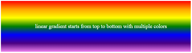
Linear Gradient Using Multiple Colors
You can define a linear gradient with multi-colors. See an example below of using multiple colors that starts from the top to bottom.
Syntax:
background-image: linear-gradient(red, orange, yellow, green, blue,indigo, violet);Source Code:
<!DOCTYPE html>
<html>
<head>
<style>
.linear{
  height: 150px;
  background-image: linear-gradient(red, orange, yellow, green, blue,indigo, violet);
  text-align: center;
  line-height: 150px;
  color: white;
}
</style>
</head>
<body>
<div class="linear">linear gradient starts from top to bottom with multiple colors
</div>

</body>
</html>
Output:
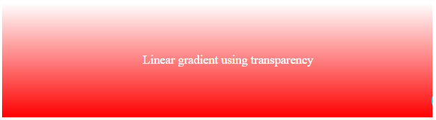
Linear Gradient Using Transparency
To define transparency, you have to use rgba color function which has 2 values. 0 indicates full transparency and 1 indicates no transparency. See an example below of the linear gradient using transparency.
Syntax:
background-image: linear-gradient(rgba(255,0,0,0), rgba(255,0,0,1));Source Code:
<!DOCTYPE html>
<html>
<head>
<style>
.linear{
  height: 150px;
  background-image: linear-gradient(rgba(255,0,0,0), rgba(255,0,0,1));
  text-align: center;
  line-height: 150px;
  color: white;
}
</style>
</head>
<body>
<div class="linear">Linear gradient using transparency
</div>

</body>
</html>
Output:
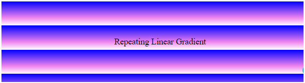
Repeating Linear Gradient
You can repeat your linear gradient colors in a pattern using the repeating-linear-gradient() function.
Syntax:
background-image: repeating-linear-gradient(blue, violet 20%, white 30%);Source Code:
<!DOCTYPE html>
<html>
<head>
<style>
.linear{
  height: 150px;
  background-image: repeating-linear-gradient(blue, violet 20%, white 30%);
  text-align: center;
  line-height: 150px;
}
</style>
</head>
<body>
<div class="linear">Repeating Linear Gradient
</div>

</body>
</html>
Output:
Donate to support the writer
You may be interested in the following topics: