The CSS Radial gradient is generated by two or more colors and defined by its center.
By default, the radial-gradient shape is Ellipse, the size is farthest-corner, and the position is center.
Syntax:
background-image: radial-gradient(shape size at position, color1, color2,..);Source Code:
<!DOCTYPE html>
<html>
<head>
<style>
.linear{
  height: 150px;
  background-image: radial-gradient(red, green, blue);
  text-align: center;
  line-height: 150px;
  color:white;
}
</style>
</head>
<body>
<div class="linear">Radial Gradient
</div>

</body>
</html>
Output:

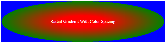
Radial Gradient Using Different Size Colors
The following example shows an ellipse shape radial gradient with different size color ends. Let’s define red as 20%, green as 70 %, and blue as 20%.
Source Code:
<!DOCTYPE html>
<html>
<head>
<style>
.linear{
  height: 150px;
  background-image: radial-gradient(red 20% , green 70% , blue 20%);
  text-align: center;
  line-height: 150px;
  color:white;
}
</style>
</head>
<body>
<div class="linear">Radial Gradient With Color Spacing
</div>

</body>
</html>
Output:
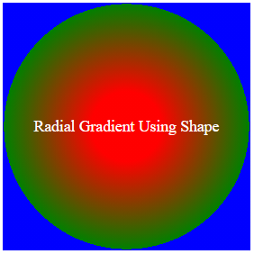
Radial Gradient Using Shape
The default value is an ellipse. It takes a circle value as well. The radial gradient has either an ellipse or circle value in shape.
The below example uses a circle shape in the radial gradient with a defined color size.
Source Code:
<!DOCTYPE html>
<html>
<head>
<style>
.linear{
  width: 250px;
  height: 250px;
  background-image: radial-gradient(circle, red 20% , green 70% , blue 20%);
  text-align: center;
  line-height: 250px;
  color:white;
}
</style>
</head>
<body>
<div class="linear"><p>Radial Gradient Using Shape</p>
</div>

</body>
</html>
Output:
Radial Gradients Using Different Sizes
The radial gradient defined four different sizes:
- Farthest-corner (default)
- Closest-corner
- Farthest-side
- Closest-side
Let’s see each size value with source code and output.
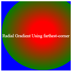
1) Farthest-corner:
This is the default value of radial-gradients size.
Source Code:
<!DOCTYPE html>
<html>
<head>
<style>
.linear{
  width: 250px;
  height: 250px;
  background-image: radial-gradient(farthest-corner at 60% 45%, red 20% , green 70% , blue 20%);
  text-align: center;
  line-height: 250px;
  color:white;
}
</style>
</head>
<body>
<div class="linear"><p>Radial Gradient Using farthest-corner</p>
</div>

</body>
</html>
Output:
2) Closest-corner:
Source Code:
<!DOCTYPE html>
<html>
<head>
<style>
.linear{
  width: 250px;
  height: 250px;
  background-image: radial-gradient(closest-corner at 60% 45%, red 20% , green 70% , blue 20%);
  text-align: center;
  line-height: 250px;
  color:white;
}
</style>
</head>
<body>
<div class="linear"><p>Radial Gradient Using closest-corner</p>
</div>

</body>
</html>
Output:
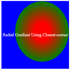
Radial Gradient Using Closest-corner
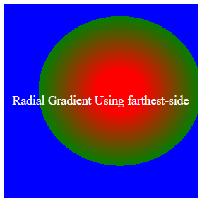
3) Farthest-side:
Source Code:
<!DOCTYPE html>
<html>
<head>
<style>
.linear{
  width: 250px;
  height: 250px;
  background-image: radial-gradient(farthest-side at 60% 45%, red 20% , green 70% , blue 20%);
  text-align: center;
  line-height: 250px;
  color:white;
}
</style>
</head>
<body>
<div class="linear"><p>Radial Gradient Using farthest-side</p>
</div>

</body>
</html>
Output:
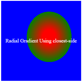
4) Closest-side:
Source Code:
<!DOCTYPE html>
<html>
<head>
<style>
.linear{
  width: 250px;
  height: 250px;
  background-image: radial-gradient(closest-side at 60% 45%, red 20% , green 70% , blue 20%);
  text-align: center;
  line-height: 250px;
  color:white;
}
</style>
</head>
<body>
<div class="linear"><p>Radial Gradient Using closest-side</p>
</div>

</body>
</html>
Output:
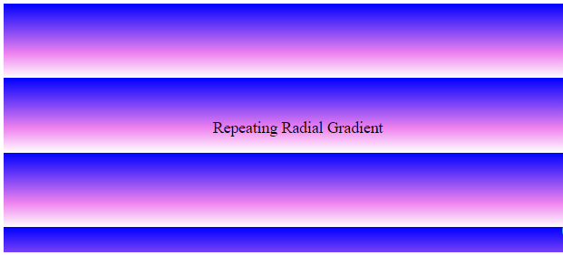
Repeating Radial Gradient
You can repeat the radial gradient in a pattern using the repeating-radial-gradient() function.
Syntax:
background-image: repeating-ra-gradient(blue, violet 20%, white 30%);Source Code:
<!DOCTYPE html>
<html>
<head>
<style>
.linear{
  height: 250px;
  background-image: repeating-linear-gradient(blue, violet 20%, white 30%);
  text-align: center;
  line-height: 250px;
}
</style>
</head>
<body>
<div class="linear"><p>Repeating Radial Gradient</p>
</div>

</body>
</html>
Output:
Donate to support the writers
You may be interested in the following topics: