Definition:
Here, you are going to learn how to create an image overlay zoon effect on mouse hover.
Let’s begin our design.
First, create a simple <html> code without any CSS code.
For this, you need an image and an overlay text. Make an HTML container and put your image and text in it.
HTML Source Code:
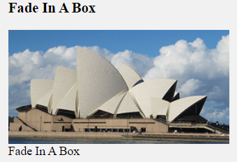
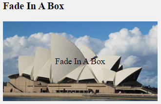
<h3 class="title">Image Overlay Zoom</h3>
      <div class = "container">
          <img src="https://www.elsebazaar.com/blog/wp-content/uploads/2019/03/About-Us-image.jpg" alt="CSS Image Overlay Zoom" class="image">

        <div class="overlay">
    		<div class="text">This is a Opera House.</div>
  		</div>
      </div>
CSS Source Code:
<style>
    .container {
         position: relative;
         width: 50%;
      }

       .image {
        display:block;
        width: 100%;
        height: auto;
        opacity: 1;
        transition: .5s ease;
      }

      .overlay {
        position: absolute;
        bottom: 0;
        left: 0;
        right: 0;
        background-color: #008CBA;
        overflow: hidden;
        width: 100%;
        height: 100%;
        transform: scale(0);
        transition: .3s ease;
	  }

      .container:hover .overlay {
 		 transform: scale(1);
	   }

      .container:hover .overlay-box
      {
        opacity: 1;
 	  }

      .text{
        background-color: black;
        color: white;
        font-size: 20px;
        position: absolute;
        top: 50%;
        left: 50%;
        transform: translate(-50%, -50%);
        text-align: center;
        padding: 10px 15px;
      }

    </style>
Full Source Code:
<!DOCTYPE html>
<html>
  <head>
    <style>
    .container {
         position: relative;
         width: 50%;
      }

       .image {
        display:block;
        width: 100%;
        height: auto;
        opacity: 1;
        transition: .5s ease;
      }

      .overlay {
        position: absolute;
        bottom: 0;
        left: 0;
        right: 0;
        background-color: #008CBA;
        overflow: hidden;
        width: 100%;
        height: 100%;
        transform: scale(0);
        transition: .3s ease;
	  }

      .container:hover .overlay {
 		 transform: scale(1);
	   }

      .container:hover .overlay-box
      {
        opacity: 1;
 	  }

      .text{
        background-color: black;
        color: white;
        font-size: 20px;
        position: absolute;
        top: 50%;
        left: 50%;
        transform: translate(-50%, -50%);
        text-align: center;
        padding: 10px 15px;
      }

    </style>

  </head>

  <body>
      <h3 class="title">Image Overlay Zoom</h3>
      <div class = "container">
          <img src="https://www.elsebazaar.com/blog/wp-content/uploads/2019/03/About-Us-image.jpg" alt="CSS Image Overlay Zoom" class="image">

        <div class="overlay">
    		<div class="text">This is a Opera House.</div>
  		</div>
      </div>
  </body>
</html>
Output:
Image Overlay Zoom
Donate to support writers.
You may be interested in the following topics:
- CSS Image Overlay Zoom
- CSS Image Overlay Icon
- CSS Image Overlay Title
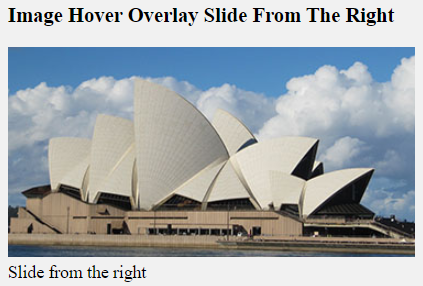
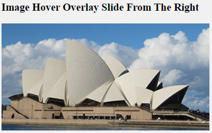
- CSS Image Hover Overlay Slide from the right
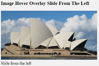
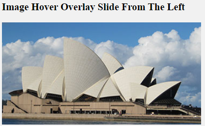
- CSS Image Hover Overlay Slide from the left
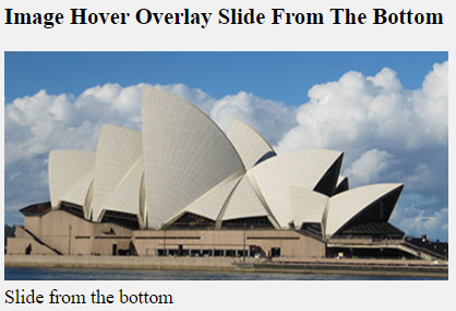
- CSS Image Hover Overlay Slide from the bottom
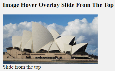
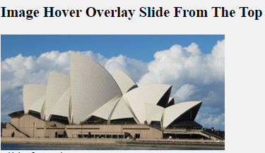
- CSS Image Hover Overlay Slide from the top
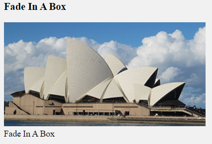
- CSS Image Hover Overlay Fade In A Box
- CSS Image Hover Overlay Fade In Text
- CSS Image Hover Overlay