In this article, I am going to show you, how you can flip your images horizontally, vertically, and background flip using CSS only.
Horizontally Flip an Image
Syntax:
img:hover {
  transform: scaleX(-1);
}
First, Let’s begin to horizontally flip an image upon mouse hover.
Source Code:
<!DOCTYPE html>
<html>
  <head>
    <style>
      .container {
        position: relative;
        width: 50%;
      }

      .image {
        display:block;
        width: 100%;
        height: auto;
        opacity:1;
      }

      .image:hover {
        transform: scaleX(-1);
       }

    </style>
  </head>

  <body>
    <h3 class="title">Horizontally Flip Image</h3>

    <div class="container">
      <img src="https://www.elsebazaar.com/blog/wp-content/uploads/2019/03/About-Us-image.jpg" alt="Horizontally Flip Image" class="image">
    </div>
  </body>
</html>
Output:
Vertically Flip an Image
The above syntax code helps your image flip horizontally in X-axis. If you want to flip your image vertically on Y-axis. You need to change the above scaleX into scaleY.
Syntax:
img:hover {
  transform: scaleY(-1);
}
Source Code:
<!DOCTYPE html>
<html>
  <head>
    <style>
      .container {
        position: relative;
        width: 50%;
      }

      .image {
        display:block;
        width: 100%;
        height: auto;
        opacity:1;
      }

      .image:hover {
        transform: scaleY(-1);
       }

    </style>
  </head>

  <body>
    <h3 class="title">Vertically Flip Image</h3>

    <div class="container">
      <img src="https://www.elsebazaar.com/blog/wp-content/uploads/2019/03/About-Us-image.jpg" alt="Vertically Flip Image" class="image">
    </div>
  </body>
</html>
Output:
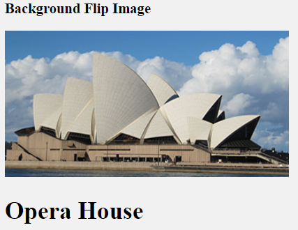
Background Flip
Here, I will show you how can you flip your front image and show the background image or text on mouse hover.
First, you need to understand basic logic. I will take an image to display on the front and a text on the background to display on mouse hover. Initially, the text visibility should be hidden and displayed only on mouse hover and change text visibility from hidden to visible.
Let’s start. First, create your <html> coding with image and text and keep it in a container.
<!DOCTYPE html>
<html>
  <head>
    <style>

    </style>
  </head>

  <body>
    <h3 class="title">Background Flip Image</h3>


    <div class="container">
      <div class="sub-container">
        <div class="image">
             <img src="https://www.elsebazaar.com/blog/wp-content/uploads/2019/03/About-Us-image.jpg" alt="Background Flip Image">
       </div>

       <div class="text">
         <h1>Opera House</h1>
       </div>
      </div>
    </div>

  </body>
</html>
Output:
CSS Coding:
First, we set a container width and height, and the background property set to transparent. Now, if you want to show in 3d flip effects, add perspective value. Otherwise, you can remove perspective.
Now, the source code of the flip 3D container.
.container{
        width: 370px;
        height: 190px;
        border: 2px solid red;
        background-color: transparent;
        perspective: 1200px;
      }
Here, the <div> sub-container is used to position the front and backside. Make its position relative to the main <div> container and defined width and height to 100%. Here, you also need to add transition and transform styles. See the code below with the above functionality.
.sub-container {
        position: relative;
        width: 100%;
        height: 100%;
        transition: transform 0.8s;
        transform-style: preserve-3d;
      }
Now, design your image, text, and hover effect by using the below code
/*Perform right to left horizontal flip on mouse hover on image*/
      .container:hover .sub-container {
        transform: rotateY(-180deg);
      }

      /*Positioned the front and back side*/
      .image, .text {
        position: absolute;
        width: 100%;
        height: 100%;
        backface-visibility: hidden;
        -webkit-backface-visibility: hidden; /* For Safari*/
      }

      /*Style your background text*/
      .text {
        background-color: green;
        color: white;
        transform: rotateY(180deg);
        text-align: center;
      }
Full Source Code:
<!DOCTYPE html>
<html>
  <head>
    <style>
      .container{
        width: 370px;
        height: 190px;
        border: 2px solid red;
        background-color: transparent;
        perspective: 1200px;
      }

     .sub-container {
        position: relative;
        width: 100%;
        height: 100%;
        transition: transform 0.8s;
        transform-style: preserve-3d;
      }

      /*Perform right to left horizontal flip on mouse hover on image*/
      .container:hover .sub-container {
        transform: rotateY(-180deg);
      }

      /*Positioned the front and back side*/
      .image, .text {
        position: absolute;
        width: 100%;
        height: 100%;
        backface-visibility: hidden;
        -webkit-backface-visibility: hidden; /*For Safari*/
      }

      /*Style your background text*/
      .text {
        background-color: green;
        color: white;
        transform: rotateY(-180deg);
        text-align: center;
      }


    </style>
  </head>

  <body>
    <h3 class="title">Background Flip Image</h3>


    <div class="container">
      <div class="sub-container">
        <div class="image">
             <img src="https://www.elsebazaar.com/blog/wp-content/uploads/2019/03/About-Us-image.jpg" alt="Background Flip Image">
       </div>

       <div class="text">
         <h1>Opera House</h1>
       </div>
      </div>
    </div>

  </body>
</html>
Output:
You may be interested in the following topics:
- CSS Image Overlay Zoom
- CSS Image Overlay Icon
- CSS Image Overlay Title
- CSS Image Filters
- CSS Flip an Images
- CSS Image Hover Overlay Slide from the right
- CSS Image Hover Overlay Slide from the left
- CSS Image Hover Overlay Slide from the bottom
- CSS Image Hover Overlay Slide from the top
- CSS Image Hover Overlay Fade In A Box
- CSS Image Hover Overlay Fade In Text
- CSS Image Hover Overlay
- CSS Text Over an Image
- CSS Transparent Images
- CSS Center an Images
- CSS Card Images
- CSS Responsive Images
- CSS Thumbnail Images
- CSS Rounded Images
- CSS Images (All Properties)