Definition:
Here, you display your images like a flashcard using CSS property and its values.
Firstly, you have to create a container and keep images and text in that container to display like a flash card with text underneath.
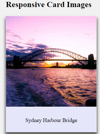
See an image below of the responsive card image that we are going to learn in the below section.
Syntax:
.container {
        width: 100%;
        background-color: lavender;
        box-shadow: 0 8px 8px 2px rgba(0, 0, 0, 0.6);
        margin-bottom: 15px;
      }

      .title {
        text-align: center;
        padding: 10px 20px;;
      }
Source Code:
<!DOCTYPE html>
<html>
  <head>
    <style>
      body {
        margin:20px;
      }

      .container {
        width: 50%;
        background-color: lavender;
        box-shadow: 0 8px 8px 2px rgba(0, 0, 0, 0.6);
        margin-bottom: 15px;
      }

      img {width: 100%}

      .title {
        text-align: center;
        padding: 10px 20px;;
      }
    </style>
  </head>
  <body>

    <h2>Responsive Card Images</h2>

    <div class="container">
      <img src="https://www.elsebazaar.com/blog/wp-content/uploads/2020/11/Sydney-Harbour-Bridge-View.jpg" alt="Sydney Harbour Bridge" style="width:100%">
      <div class="title">
        <p>Sydney Harbour Bridge</p>
      </div>
    </div>

  </body>
</html>
Output
Click “TRY IT YOURSELF” to see the results.
Donate to support writers.
You may be interested in the following topics:
- CSS Image Overlay Zoom
- CSS Image Overlay Icon
- CSS Image Overlay Title
- CSS Image Filters
- CSS Flip an Images
- CSS Image Hover Overlay Slide from the right
- CSS Image Hover Overlay Slide from the left
- CSS Image Hover Overlay Slide from the bottom
- CSS Image Hover Overlay Slide from the top
- CSS Image Hover Overlay Fade In A Box
- CSS Image Hover Overlay Fade In Text
- CSS Image Hover Overlay
- CSS Text Over an Image
- CSS Transparent Images
- CSS Center an Images
- CSS Card Images
- CSS Responsive Images
- CSS Thumbnail Images
- CSS Rounded Images
- CSS Images (All Properties)