Definition:
Here, I am going to show how you can give an image slide effect from the top, bottom, left, and right sides.
Let’s first start with the Image hover slide effect from the bottom.
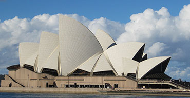
Our task to complete is, whenever we put our mouse over an image, the image shows a sliding effect that travels from bottom to top and displays some user-choice text. Here I will just display the text “Slide from the bottom”.
Here is an example we are going to design. Put your mouse cursor over the below image.
Let’s begin our designing.
First, create a simple <html> code without any CSS code.
<!DOCTYPE html>
<html>
  <head>

  </head>

   <body>
      <h3 class="title">Image Hover Overlay Slide From The Bottom</h3>
      <div class="container">
          <img src="https://www.elsebazaar.com/blog/wp-content/uploads/2019/03/About-Us-image.jpg" alt="Image Hover Overlay Slide From The Bottom" class="image">

        <div class="overlay-bottom-slide">
    		<div class="text">Slide from the bottom</div>
  		</div>
      </div>
  </body>
</html>
Output:
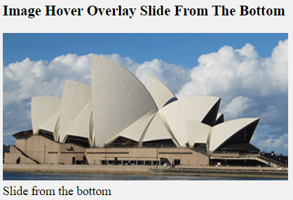
Now, style your container and image. Make sure you keep your container position relative and container width will be your design requirement. Here, I have given 50%. You can give 10%, 20%, 100%, or your chosen size.
.container {
         position: relative;
         width: 50%;
      }
Now, we need to design the image with an opacity defined as 1. The opacity will only change as the mouse hovers over the image. Initial opacity will remain at 1 which means your image shows in full transparency.
Make your width 100 percent which covers all your container size and height remains auto. Add the below code to your style sheet.
.image {
        display:block;
        width: 100%;
        height: auto;
        opacity: 1;
      }
Output:
Your output still looks the same as before.

Now, it’s time to design your overlay. The overlay must be the same size as your image and in an absolute position and at the center of the image. Now, add the below code to your style sheet.
.overlay-bottom-slide {
        position: absolute;
        opacity:0;
        bottom:0;
        right:0;
        top:100%;
        height:0;
  	width:100%;
        overflow: hidden;
        transition: .5s ease;
        background-color: blue;
	  }
Output:
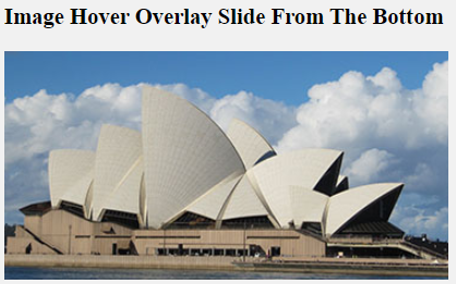
Your output looks like this:
Now apply the hover effect on the image and overlay. Add the below code to your style sheets.
.container:hover .image {
 		 opacity:0.7;
	   }

      .container:hover .overlay-bottom-slide
      {
        top: 0;
        height: 100%;
        opacity:0.5;
 	  }
Output:
Now, the output looks like the below:
Image Hover Overlay Slide From The Bottom

Now, it is time to design your text, put your text in the absolute center with white color text.
Add the below code to your style sheet
.text{
        color: white;
        font-size: 14px;
        padding: 10px 15px;
        text-align: center;
        position:absolute;
        top:50%;
        left:50%;
        transform: translate(-50%, -50%);
        -ms-transform: translate(-50%, -50%);
      }
Now, See your final result by clicking the below “TRY IT YOURSELF” button.
Donate to support writers.
You may be interested in the following topics:
- CSS Image Overlay Zoom
- CSS Image Overlay Icon
- CSS Image Overlay Title
- CSS Image Hover Overlay Slide from the right
- CSS Image Hover Overlay Slide from the left
- CSS Image Hover Overlay Slide from the bottom
- CSS Image Hover Overlay Slide from the top
- CSS Image Hover Overlay Fade In A Box
- CSS Image Hover Overlay Fade In Text
- CSS Image Hover Overlay
