Definition:
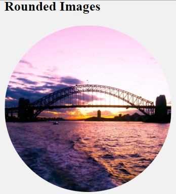
By default, an image is shown in rectangular views. If you want to change your image into rounded images, use the border-radius property. The border-radius property changes each side of the image edge according to your border-radius value.
50% border radius property value makes your image into rounded images.
See an example below which uses a border-radius of 50%.
Syntax:
img {
  border-radius: 50%;
}
Source Code:
<!DOCTYPE html>
<html>
  <head>
    <style>
      img {
        border-radius: 50%;
      }
    </style>
  </head>
  <body>
    <h2>Rounded Images</h2>
    <img src="https://www.elsebazaar.com/blog/wp-content/uploads/2020/11/Sunset-Harbour-Bridge-View.jpg" alt="Sunset Harbour Bridge" width="300" height="300">
  </body>
</html>
Output
Click “TRY IT YOURSELF” to see the results.
Try yourself by changing the property value to 10%, 20%, or your custom values to see the differences.
Donate to support writers.
You may be interested in the following topics:
- CSS Image Overlay Zoom
- CSS Image Overlay Icon
- CSS Image Overlay Title
- CSS Image Filters
- CSS Flip an Images
- CSS Image Hover Overlay Slide from the right
- CSS Image Hover Overlay Slide from the left
- CSS Image Hover Overlay Slide from the bottom
- CSS Image Hover Overlay Slide from the top
- CSS Image Hover Overlay Fade In A Box
- CSS Image Hover Overlay Fade In Text
- CSS Image Hover Overlay
- CSS Text Over an Image
- CSS Transparent Images
- CSS Center an Images
- CSS Card Images
- CSS Responsive Images
- CSS Thumbnail Images
- CSS Rounded Images
- CSS Images (All Properties)