CSS Responsive Images

Please Share On:

Definition:

CSS responsive images will automatically resize your images according to your device screen.

Syntax:

img {
  max-width: 100%;
  height: auto;
}

Source Code:

<!DOCTYPE html>
<html>
  <head>
    <style>
      h2{
        text-align: center;
      }
      
      img {
        max-width: 100%;
        height: auto;
      }   
    </style>
  </head>
  
  <body>
    <h2>Responsive Images</h2>
    <img src="https://www.elsebazaar.com/blog/wp-content/uploads/2020/11/Sydney-Harbour-Bridge-View.jpg" alt="Sydney Harbour Bridge"> 
  </body>
</html>


Output

Click “TRY IT YOURSELF” to see the results and make sure to resize the image to see the responsive image effects.


Donate to support writers.


You may be interested in the following topics:

CSS Thumbnail Images

Please Share On:

Definition:

CSS thumbnail images are mostly used in small screen devices. You can change your images into thumbnail images size by using the width and height of the images.

The mostly used thumbnail width and height sizes are 150 x 150 px. You can use your own thumbnail height and width values.

Syntax:

img {
  width: 150px;
  height: 150px;
}

Source Code:

<!DOCTYPE html>
<html>
  <head>
    <style>
      img {
        width: 150px;
        height: 150px;
      }
    </style>
  </head>
  <body>
    <h2>Rounded Images</h2>
    <img src="https://www.elsebazaar.com/blog/wp-content/uploads/2020/11/Sunset-Harbour-Bridge-View.jpg" alt="Sunset Harbour Bridge" width="300" height="300">
  </body>
</html>

Output

Click “TRY IT YOURSELF” to see the results.


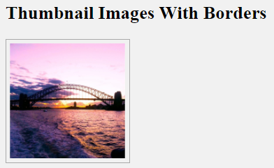
Thumbnail Image With Border Value

To give your thumbnail image a better look, use a border and padding property value. See an example below of using border and padding property value in thumbnail image.

Syntax:

img {
        border: 1px solid #a9a9a9;
        padding: 5px;
        width: 150px;
        height: 150px;
      }

Source Code:

<!DOCTYPE html>
<html>
  <head>
    <style>
      img {
        border: 1px solid #a9a9a9;
        padding: 5px;
        width: 150px;
        height: 150px;
      }
    </style>
  </head>
  <body>
    <h2>Thumbnail Images</h2>
    <img src="https://www.elsebazaar.com/blog/wp-content/uploads/2020/11/Sunset-Harbour-Bridge-View.jpg" alt="Sunset Harbour Bridge" width="300" height="300">
  </body>
</html>

Output:

Click “TRY IT YOURSELF” to see the results.


Donate to support writers.


You may be interested in the following topics:

CSS Rounded Images

Please Share On:

Definition:

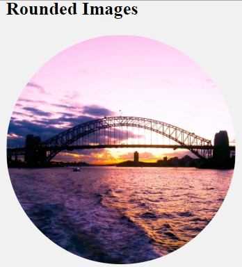
By default, an image is shown in rectangular views. If you want to change your image into rounded images, use the border-radius property. The border-radius property changes each side of the image edge according to your border-radius value.

50% border radius property value makes your image into rounded images.

See an example below which uses a border-radius of 50%.

Rounded Images

Syntax:

img {
  border-radius: 50%;
}

Source Code:

<!DOCTYPE html>
<html>
  <head>
    <style>
      img {
        border-radius: 50%;
      }
    </style>
  </head>
  <body>
    <h2>Rounded Images</h2>
    <img src="https://www.elsebazaar.com/blog/wp-content/uploads/2020/11/Sunset-Harbour-Bridge-View.jpg" alt="Sunset Harbour Bridge" width="300" height="300">
  </body>
</html>

Output

Click “TRY IT YOURSELF” to see the results.

Try yourself by changing the property value to 10%, 20%, or your custom values to see the differences.


Donate to support writers.


You may be interested in the following topics:

CSS Images (All Properties)

Please Share On:

Definition:

With the help of CSS code, you can convert your original image into different styles accordingly you want. Below are the lists of some CSS image styling:

Images StylesDefinitions
1) Rounded ImagesDisplay a rounded image
2) Thumbnail ImagesCreate an image in thumbnail size
3) Responsive ImagesResize the image to fit the device screen
4) Card ImagesDisplay images like flashcard
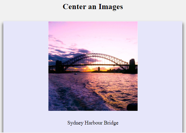
5) Center an ImagesKeep your image at the center of the screen
6) Transparent ImagesDisplay images with different opacity
7) Text Over an ImageWrite text over images
8) Image Hover OverlayShow image hover effects
9) Flip an imagesFlip over an image on mouse hover
10) Image FiltersAdd visual effects like saturation and blur

Donate to support writers.


You may be interested in the following topics:

Copyright @2023. All Right Reserved.


Social media & sharing icons powered by UltimatelySocial