CSS Gradients (All Properties)

Please Share On:

Definition:

CSS gradients show a smooth transition between two or more colors. It is defined in two ways: Linear Gradients and Radial Gradients.

Linear Gradients:

Linear Gradients

Linear Gradients from left to right with red to yellow color

Radial Gradients

Radial Gradients
Defined by the center

Click the above link to learn more in detail about Linear Gradients and Radial Gradients.


Donate to support the writer


You may be interested in the following topics:

CSS Image Hover Dropdown

Please Share On:

Definition:

You can also show a dropdown on the image hover. When you put your mouse over an image, it shows an image and other contents.

Let’s see it with an example.

Source Code:

<!DOCTYPE html>
<html>
  <head>
    <style>
    body{
    height: 350px;
    }

    .dropdown {
      position: relative;
      display: inline-block;
    }

    .dropdown-item {
      display: none;
      position: absolute;
      background-color: darkred;
      min-width: 200px;
      z-index: 1;
    }

    .dropdown:hover .dropdown-item {
      display: block;
    }

    .caption {
      padding: 15px;
      text-align: center;
      text-decoration: underline;
      color:white;
    }
    </style>
  </head>
  
  <body>
    <h2>Image Hover Dropdown</h2>
    <p>Move the cursor over the below image to see dropdown.</p>

    <div class="dropdown">
      <img src="https://www.elsebazaar.com/blog/wp-content/uploads/2019/03/Geeta.jpg" alt="Beautiful Asian Girl" width="100" height="75">
      <div class="dropdown-item">
      <img src="https://www.elsebazaar.com/blog/wp-content/uploads/2019/03/Geeta.jpg" alt="Beautiful Asian Girl" width="400" height="300">
      <div class="caption">Beautiful Asian Girl</div>
      </div>
    </div>
  </body>
</html>

Output:

Image Hover Dropdown

Move the cursor over the below image to see dropdown.


Donate to support writers


You may be interested in the following topics:

CSS Navigation Dropdown Menu

Please Share On:

Definition:

CSS Navigation dropdown menu enhances your website and makes it professional looks by organizing the sub-categories items under the main categories.

See an example below of CSS Navigation Dropdown Menu source code and output.

Source Code:

<!DOCTYPE html>
<html>
  <head>
    <meta name="viewport" content="width=device-width, initial-scale=1">
    <link rel="stylesheet" href="https://cdnjs.cloudflare.com/ajax/libs/font-awesome/4.7.0/css/font-awesome.min.css">
    <style>
    body{
    height: 400px;
    }

    .navigation_menu_item {
      overflow: hidden;
      /*dark blue background color*/
      background-color: #00008b;
    }

    .navigation_menu_item a {
      float: left;
      padding: 10px 20px;
      font-size: 20px;
      color: white; /*font color white*/
      text-decoration: none;
      text-align: center;
    }

    .dropdown {
      float: left;
      overflow: hidden;
    }

    .dropdown .dropbutton {
      font-size: 20px;  
      border: none;
      outline: none;
      color: white;
      padding: 10px 20px;
      background-color: inherit;
      font-family: inherit;
      margin: 0;
    }

    .navigation_menu_item a:hover, .dropdown:hover .dropbutton {
      background-color: #e0ffff;
      color: black;
    }

    .dropdown-content {
      display: none;
      position: absolute;
      background-color: #e6e6fa;
      min-width: 30%;
      z-index: 1;
    }

    .dropdown-content a {
      display: block;
      float: none;
      color: black;
      padding: 10px 20px;
      font-size: 18px;
      text-decoration: none;
      text-align: left;
    }

    .dropdown:hover .dropdown-content {
      display: block;
    }

    .dropdown-content a:hover {
      background-color: #87cefa;
    }
    </style>
  </head>
  
  <body>
    <div class="navigation_menu_item">
      <a href="#home">Home</a>
      <a href="#about_us">About Us</a>
      <div class="dropdown">
        <button class="dropbutton">Shop 
          <i class="fa fa-caret-down"></i>
        </button>
        <div class="dropdown-content">
          <a href="#">Accessories</a>
          <a href="#">Shoes</a>
          <a href="#">Clothing</a>
          <a href="#">Bags</a>
        </div>
      </div> 
      <a href="#blog">Blog</a>
      <a href="#contact">Contact</a>
    </div>
  </body>
</html>

Output:


Donate to support writers


You may be interested in the following topics:

CSS Text Hover Dropdown

Please Share On:

Definition:

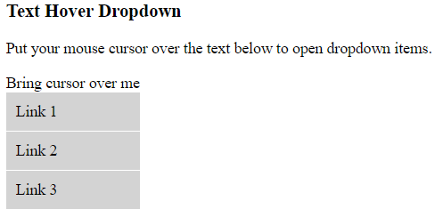
CSS text hover dropdown appears when you put your mouse cursor over the text and a dropdown item will be shown. See a source code to achieve this function using CSS code.

Mouse Over Text Dropdown

Source Code:

Text Hover Dropdown

<!DOCTYPE html>
<html>
  <head>
    <style>
    .dropdown {
      position: relative;
      display: inline-block;
    }

    .dropdown_item {
      display: none;
      position: absolute;
      background-color: lightgray;
      min-width: 100%;

    }

    .dropdown_item a {
      display: block;
      color: black;
      padding: 10px;
      text-decoration: none;
      border-bottom:1px solid white;
    }

    .dropdown:hover .dropdown_item {
      display: block;
    }

    .dropdown_item a:hover {
       background-color: #f8f8ff
      }
    </style>
  </head>
  
  <body>
    <h3>Text Hover Dropdown</h3>
    <p>Put your mouse cursor over the text below to open dropdown items.</p>

    <div class="dropdown">
      <span>Bring cursor over me</span>
      <div class="dropdown_item">
      <a href="#">Link 1</a>
      <a href="#">Link 2</a>
      <a href="#">Link 3</a>
      </div>
    </div>
  </body>
</html>

Output:

Before text hover dropdown

After text hover dropdown


Donate to support writers


You may be interested in the following topics:

CSS Dropdown

Please Share On:

Definition:

CSS dropdown menu is used when you want to show sub-categories on the mouse over the main categories. You can show dropdown items over the simple text, navigation bar, and images.

Text Hover Dropdown

Click Here, to understand how to use text hover dropdown using CSS.

Navigation Bar Dropdown

Navigation Dropdown

Click Here, to learn more in detail about how you make your navigation menu as a dropdown menu.

Image Hover Dropdown

Image Hover Navigation

Click Here, to see how you achieve the above image hover navigation content.


You may be interested in the following topics:

CSS Fixed H. Navigation Bar

Please Share On:

Definition:

CSS fixed horizontal navigation bar can be at the top or bottom of your page. See an example below of using a fixed horizontal navigation bar.

Horizontal Navigation Bar

Fixed Top Horizontal Navigation Bar Syntax:

ul {
  position: fixed;
  top: 0;
  width: 100%;
}

Fixed Bottom Horizontal Navigation Bar Syntax:

ul {
  position: fixed;
  bottom: 0;
  width: 100%;
}

Fixed Top Navigation Bar Source Code

<!DOCTYPE html>
<html>
  <style> 
    body {
      margin:5px;
    }
    ul {
      list-style-type: none;
      margin: 0;
      padding: 0;
      overflow: hidden;
      background-color: grey;
      position: fixed;
      top: 0;
      width: 100%;
    }

    li {
      float:left;
      list-style-type: none;
      border-right: 3px solid grey;
    }
    li:last-child {
      border-right: none;
    }

    a {
      display: block;
      padding: 8px;
      background-color: #dddddd;
      text-decoration:none;
    }

  </style>
  <body>
    <ul>
      <li><a href="#home">Home</a></li>
      <li><a href="#about_us">About Us</a></li>
      <li><a href="#blog">Blog</a></li>
      <li><a href="#contact">Contact</a></li>
    </ul>
    <br>
    <div class="body">
      <h3> Fixed Top Navigation Bar</h3>
      <p> 
        Ullamcorper molestie volutpat egestas placerat leo orci. Elementum mattis porttitor <strong>ultricies</strong> ac hendrerit pretium. Adipiscing facilisis erat dictum aliquam interdum sagittis fermentum ultricies phasellus metus urna dictumst purus risus. Sed imperdiet nec facilisi curae; vivamus posuere vestibulum gravida orci natoque consequat adipiscing sagittis auctor eu Neque inceptos nostra nibh faucibus potenti dictum placerat nulla congue faucibus, pede. Nam litora torquent vestibulum consectetuer ipsum taciti interdum hac convallis, dictum bibendum. Dapibus. Imperdiet est etiam Iaculis habitant <strong>volutpat</strong> ligula et. Malesuada rhoncus lacus iaculis massa, leo hendrerit dapibus imperdiet eget non magna molestie blandit <strong>varius</strong> conubia sodales tempus. Hendrerit urna habitasse dis.</p>
    </div>
  </body>
</html>


Output:

CSS Fixed Horizontal Navigation Bar

Fixed Bottom Navigation Bar Source Code:

From the above source code, replace top:0; by bottom:0; which will put your horizontal navigation bar at the bottom of your page and over your content.

See the below Source Code and output :

<!DOCTYPE html>
<html>
  <style> 
    body {
      margin:5px;
    }
    ul {
      list-style-type: none;
      margin: 0;
      padding: 0;
      overflow: hidden;
      background-color: grey;
      position: fixed;
      bottom: 0;
      width: 100%;
    }

    li {
      float:left;
      list-style-type: none;
      border-right: 3px solid grey;
    }
    li:last-child {
      border-right: none;
    }

    a {
      display: block;
      padding: 8px;
      background-color: #dddddd;
      text-decoration:none;
    }

  </style>
  <body>
    <ul>
      <li><a href="#home">Home</a></li>
      <li><a href="#about_us">About Us</a></li>
      <li><a href="#blog">Blog</a></li>
      <li><a href="#contact">Contact</a></li>
    </ul>
    <br>
    <div class="body">
      <h3> Fixed Bottom Navigation Bar</h3>
      <p> 
        Ullamcorper molestie volutpat egestas placerat leo orci. Elementum mattis porttitor <strong>ultricies</strong> ac hendrerit pretium. Adipiscing facilisis erat dictum aliquam interdum sagittis fermentum ultricies phasellus metus urna dictumst purus risus. Sed imperdiet nec facilisi curae; vivamus posuere vestibulum gravida orci natoque consequat adipiscing sagittis auctor eu Neque inceptos nostra nibh faucibus potenti dictum placerat nulla congue faucibus, pede. Nam litora torquent vestibulum consectetuer ipsum taciti interdum hac convallis, dictum bibendum. Dapibus. Imperdiet est etiam Iaculis habitant <strong>volutpat</strong> ligula et. Malesuada rhoncus lacus iaculis massa, leo hendrerit dapibus imperdiet eget non magna molestie blandit <strong>varius</strong> conubia sodales tempus. Hendrerit urna habitasse dis.</p>
    </div>
  </body>
</html>

Output:

Fixed Bottom Navigation Bar


Donate to support writers


You may be interested in the following topics:

CSS Horizontal Navigation Bar

Please Share On:

Definition:

CSS Horizontal Navigation bar displays the menu horizontally. To build a horizontal menu, you need to specify the <li> elements into display inline.

Horizontal Navigation Bar

See an below image of horizontal navigation bar.

By default <li> elements are display in a list, you need to use list-style-type property to hide the bullets and apply display:inline property to <li> elements.

See an example below with source code.

Source Code:

<!DOCTYPE html>
<html>
  <style>
    ul {
      list-style-type: none;
      margin: 0;
      padding: 0;
      width: 200px;
      background-color: lightgrey;
    }

    li {
      display: inline;
    }
  </style>
  <body>
    <h3> Horizontal Naviation Bar</h3>
    <ul>
      <li><a href="#home">Home</a></li>
      <li><a href="#about_us">About Us</a></li>
      <li><a href="#blog">Blog</a></li>
      <li><a href="#contact">Contact</a></li>
    </ul>

  </body>
</html>

Output:

Horizontal Navigation Bar

Floating List Items

You can make horizontal list items by applying float property in <li> elements. See an example below of using float property to create horizontal menu bar.

Source Code:

<!DOCTYPE html>
<html>
  <style> 
    li {
      float:left;
      list-style-type: none;
    }

    a {
      display: block;
      padding: 8px;
      background-color: #dddddd;
    }

  </style>
  <body>
    <h3> Floating Horizontal List Items</h3>
    <ul>
      <li><a href="#home">Home</a></li>
      <li><a href="#about_us">About Us</a></li>
      <li><a href="#blog">Blog</a></li>
      <li><a href="#contact">Contact</a></li>
    </ul>
  </body>
</html>

Output:

floating horizontal list items


Right Align List Item

If you need your last <li> item in the right hand side and other remain same at left hand side, apply the below style to your last <li>

style="float:right"

Source Code:

<!DOCTYPE html>
<html>
  <style> 
    li {
      float:left;
      list-style-type: none;
    }
    li:nth-child(4){
      float:right;
    }

    a {
      display: block;
      padding: 8px;
      background-color: #dddddd;
    }

  </style>
  <body>
    <h3> Right Align List Item</h3>
    <ul>
      <li><a href="#home">Home</a></li>
      <li><a href="#about_us">About Us</a></li>
      <li><a href="#blog">Blog</a></li>
      <li><a href="#contact">Contact</a></li>
    </ul>
  </body>
</html>

Output:

right align list item

In the above source code, the fourth element “contact” is selected by using nth-child(n) property and apply float: right property value to keep at the end of the right side.


Horizontal Navigation Bar With Border Right Dividers

To separate each navigation bar, you need to apply border-right in your <li> elements and remove the border at your last <li> child.

See the below source code and output to understand more in details.

Source Code:

<!DOCTYPE html>
<html>
  <style> 
    li {
      float:left;
      list-style-type: none;
      border-right: 3px solid grey;
    }
    li:last-child {
      border-right: none;
    }

    a {
      display: block;
      padding: 8px;
      background-color: #dddddd;
      text-decoration:none;
    }

  </style>
  <body>
    <h3> Border Right Dividers</h3>
    <ul>
      <li><a href="#home">Home</a></li>
      <li><a href="#about_us">About Us</a></li>
      <li><a href="#blog">Blog</a></li>
      <li><a href="#contact">Contact</a></li>
    </ul>
  </body>
</html>

Output:

border right dividers

Horizontal Navigation Bar With Border Left Dividers

You can also use border-left to separate the navigation bar menu, but make sure you only apply the border-left property to all <li> elements except the first child of <li> element.

See an below example with source code and output.

Source Code:

<!DOCTYPE html>
<html>
  <style> 
    li {
      float:left;
      list-style-type: none;
      border-left: 3px solid grey;
    }
    li:first-child {
      border-left: none;
    }

    a {
      display: block;
      padding: 8px;
      background-color: #dddddd;
      text-decoration:none;
    }

  </style>
  <body>
    <h3> Border Left Dividers</h3>
    <ul>
      <li><a href="#home">Home</a></li>
      <li><a href="#about_us">About Us</a></li>
      <li><a href="#blog">Blog</a></li>
      <li><a href="#contact">Contact</a></li>
    </ul>
  </body>
</html>

Output:

border-left dividers


Donate to support writers


You may be interested in the following topics:

CSS Vertical Navigation Bar

Please Share On:

Definition:

CSS Vertical Navigation bar displays all your menu items vertically. See a below example of a vertical Navigation Bar. To create a vertical navigation bar, you need to style <a> element inside <li>.

Vertical Navigation Bar

Source Code:

<!DOCTYPE html>
<html>
  <style>
    ul {
      list-style-type: none;
      margin: 0;
      padding: 0;
      width: 300px;
      background-color: lightgrey;
    }

    li a {
      display: block;
      color: black;
      padding: 8px 16px;
      text-decoration: underline;
    }

    /* Change the link color on hover */
    li a:hover {
      background-color: black;
      color: white;
    }
  </style>
  <body>
    <h3> Vertical Naviation Bar</h3>
    <ul>
      <li><a href="#home">Home</a></li>
      <li><a href="#about_us">About Us</a></li>
      <li><a href="#blog">Blog</a></li>
      <li><a href="#contact">Contact</a></li>
    </ul>

  </body>
</html>

Output:

Vertical Navigation Bar


Donate to support writers


You may be interested in the following topics:

CSS Navigation Bar Define

Please Share On:

Definition:

CSS Navigation bar can be horizontal or vertical. You can change your navigation bar either way according to your website design by using CSS code.

Horizontal Navigation Bar

See the below image of the horizontal navigation bar.

Vertical Navigation Bar

Fixed Horizontal Navigation Bar

Click me to learn in detail about the fixed horizontal navigation bar.


Donate to support writers


You may be interested in the following topics:

CSS Opacity Define

Please Share On:

Definition:

CSS Opacity is also known as CSS transparency. It specifies the transparency of an element. You can apply transparency wherever you needed like at the image, hover the image, text in a transparent box, and so on.

Syntax:

opacity: 0.4;

Image Opacity:

The default opacity value is 1. The opacity value starts from 0.0 to 1. The lower value is the most transparent element.

Source Code:

<!DOCTYPE html>
<html>
  <head>
    <style>
      img {
        opacity: 0.5;
      }
    </style>

  </head>
  <body>
    <h3>Image Transparent 50% </h3>
    <img src="https://www.elsebazaar.com/blog/wp-content/uploads/2019/03/About-Us-image.jpg" alt="Image Opacity" width="170" height="100">
  </body>
</html>


Output:


Transparent Image Hover Effect:

It shows a transparent image when the mouse hovers over an image. See the source code with output in the below example.

Source Code:

<!DOCTYPE html>
<html>
  <head>
    <style>
      img {
        opacity: 0.5;
      }

      img:hover {
        opacity: 1.0;
      }
    </style>
  </head>
  <body>

    <h3>Image Transparent is 50% <br> Transparent Hover effect is 100%</h3>
    <img src="https://www.elsebazaar.com/blog/wp-content/uploads/2019/03/About-Us-image.jpg" alt="Image Opacity" width="170" height="100">
  </body>
</html>

Output:

Before Hover Effect
After Hover Effect


Transparent Container:

When you use the opacity property to add transparency in the background container, all of its child elements inherit the same transparent. As a result, if you have text inside the container will have the same parent opacity and it will make it a bit hard to read the text.

See an example below of using transparent in parent container and its child text elements also have same transparent.

Source Code:

<!DOCTYPE html>
<html>
  <head>
    <style>
      .title{
        text-align: center;
      }

      div {
        background-color: blue;
        padding: 5px;
      }

      div.first {
        opacity: 0.3;
      }

      div.second {
        opacity: 0.5;
      }

      div.third {
        opacity: 0.8;
      }
    </style>
  </head>
  <body>

    <h3 class="title">Transparent Container</h3>
    <div class="first"><p>Opacity 0.3</p></div>
    <div class="second"><p>Opacity 0.5</p></div>
    <div class="third"><p>Opacity 0.8</p></div>
    <div><p>opacity 1</p></div>
  </body>
</html>

Output:

In the above example, the child element text has the same transparency as its parent element.

Transparent Using RGBA

In the above example, both parent and child elements use the same opacity value. If you want the child element not to use its parent element opacity then the best way to use transparent is by using the RGBA value in your parent background element.

Source Code:

<!DOCTYPE html>
<html>
  <head>
    <style>
      .title{
        text-align: center;
      }

      div {
        background: rgba(0, 0, 255, 1.0);
        padding: 5px;
      }

      div.first {
        background: rgba(0, 0, 255, 0.1);
      }

      div.second {
        background: rgba(0, 0, 255, 0.3);
      }

      div.third {
        background: rgba(0, 0, 255, 0.6);
      }
    </style>
  </head>
  <body>
    <h3 class="title">Opacity applies only on background element, not at text element</h3>
    <div class="first"><p>Opacity 0.1</p></div>
    <div class="second"><p>Opacity 0.3</p></div>
    <div class="third"><p>Opacity 0.6</p></div>
    <div><p>opacity 1</p></div>
  </body>
</html>

Output:


You may be interested in the following topics:

Copyright @2023. All Right Reserved.


Social media & sharing icons powered by UltimatelySocial